Ridiculous Mobile Phone Upgrade Charge
Last week John C. Dvorak wrote a column entitled A Crusade Against Roaming Charges in which he complains about ths silliness of roaming charges. The whole things is a scam, he says. Rather than charge customers exorbitant fees for roaming outside their carriers coverage area wireless providers should charge their customers whatever the local charges are and work out the details among themselves. But no, Dvorak says, the carriers like roaming charges because it’s found money for them.
My current personal phone situation brought to light another one of these bogus charges. I’m currently using a very old mobile phone in order to preserve an old family plan in which I’m paying less money for more services than any of the newer plans my carrier offers. If I want to change my phone for a newer one, such as an iPhone or Android phone I’d have to sign up for one of the newer plans which would double my monthly bill. That’s not an exaggeration. I’d be paying twice as much a month for the same exact services.
As crazy as this may sound that’s not what I’m writing this post to complain about (though those who follow me on Twitter have seen my complaints about that). Read on.
Recently I’ve become more open to the idea of a new phone because there are certain things I’d like to do that my old phone just can’t do. So I talked with someone from my carrier who gave me a very nice breakdown of my plan options including prices (before taxes and other charges, which is a rant for another time). One of the items mentioned in the breakdown was a one time upgrade fee. To borrow a quote from Ferris Bueller’s Day Off “Here’s where Cameron goes berserk”.
Apparently my decision to pay this carrier twice as much money each month is not enough. I actually have to pay them for the privilege of paying them more. Of all the ludicrous things American mobile carriers do this has to be right at the top. (It’s right up there with the way they subsidize phone prices but again I digress.) This is a charge for charge sake. Considering the additional money I’m committing to pay them for the next two years (because, of course, I must renew my contract for another two years – yet another complaint) you think they’d hand deliver me the phone the second I called to inquire. But no, these money grubbers take the opportunity to throw another charge at me instead.
Unfortunately I have no choice but to pay the fee for the upgrade. I’m already under contract because of a different phone on my family plan and to break my phone out to another provider where, presumably, I could get started at a cheaper rate would cause me to incur even more charges for breaking out of my contract (still another complaint).
I know it sounds silly complaining about a fee that, in the grand scheme of things, doesn’t amount to much. But it’s the principle of the whole things that upsets me. An I’m sure I’m not the only one.
Comments to this post
Pros and Cons of Twitter for iPhone
A couple of weeks ago, after getting the new version of Twitter for iPhone (iTunes), I found myself unsatisfied. I set out to write exactly why and found that creating a pro and con list led to many more cons than pros. Instead of writing a post about it I ended up trying a few different Twitter clients for the iPhone. If you follow me on Twitter you’ve probably read my critiques and praises of some of the features of the clients I’ve tried. Unfortunately each one had an issue that drove me back to Twitter for iPhone.
Here is my list of cons in no particular order:
- In previous versions of the app you could swipe your finger over a tweet in your stream to bring up a menu bar of actions you could take on it (reply, retweet, etc.). In the new version you must tap on the tweet to enter the details page for it before taking any of these actions. This takes away some convenience and hurts the user experience.
- Previous versions had an icon on the top left corner of the stream view that would go to a list of accounts (for those users who had multiple accounts). In the new version you must enter your profile (by tapping the Me icon on the bottom right) and then tap Switch Accounts at the bottom of your profile. Once again some convenience is sacrificed as well as user experience.
- There is no option for a URL shortener or custom photo sharing. These features were actually removed several versions ago but are important to the way I use Twitter so bears repeating in my own list of cons. I understand why they removed these features (they have their own versions that help their own income that they want people to use) but it’s annoying to me nonetheless.
- Poor use of screen space. There are margins on the left and right of the stream and the top bar, which bears nothing but a Twitter logo and a post button, is too big. I’d have no problem with the size of the top bar if it were more functional but there’s no reason for the margins. An iPhone’s screen is only so wide so why not make use of the whole width?
- The time of tweets given as how much time has past since the tweet was posted as opposed to the actual time of the tweet. This is not such a big deal for tweets within the last hour as they are given in the format of x minutes ago. But anything over an hour is approximated by the hour. For example anything between from 60 minutes ago to 119 minutes ago is 1 hour ago, anything from 120 minutes to 179 minutes ago is 2 hours ago, etc. When I’m catching up on tweets in the morning seeing “5:23 am” is more useful to me then “2h”.
- There is no way to add someone to a Twitter list. No joke. Twitter’s own app cannot use their own feature.
- One of the things I liked about the previous version was that the date a user joined was on their profile. The omission of this information in the current version is not a big deal but I liked it.
- When someone does a twitter style retweet their real name is displayed instead of their Twitter handle. I’m more likely to recognize who the retweeter is if they Twitter name is displayed.
- When viewing a Twitter retweet (tapping it in the stream to see the tweet itself) the name of the retweeter disappears so you have to go back to the stream to see it.
- Discover has replaced the DM button on the bottom of the screen. I’d rather have DM there and put Discover in the Me section. Again, this is one I understand (Twitter trying to spread it’s wings and commercialize itself) but it hurts the user experience since this is pretty much a useless tab.
Twitter for iPhone isn’t all bad. In fact I have a list of pros as well. Here they are in no particular order:
- When you opened the old version it would load the last 100 tweets in your stream. If there were more than 100 tweets since the last time you opened the app there was no way to fill the gap between the last 100 and the last tweet previously downloaded. The new version has a ‘load more Tweets’ link that loads 100 more tweets to fill in the gap. If there’s still a gap just hit ‘load more Tweets’ until the gap disappears.
- When viewing a tweet (tapping it in the stream to see the tweet itself) replies to the tweet are listed. There are also links to lists of the people who have retweeted and favorited the tweet.
- The Replies button on the bottom of the screen has been replaced with Connect. Tapping this gives the user the option of showing Interactions (mentiones, retweets & follows) or just mentions.
- Search functionality has been added to the Connect section.
- When viewing a mention in the Connect section the previous and later replies (if any) are displayed. It’s like reading a conversation.
Comments to this post
Making The Atom Feed For A Tag in Google Reader Public
Google recently changed it’s sharing functionality in Google Reader to share exclusively with Google+. As part of this change starred and tagged items changed too. Specifically the behavior of their associated ATOM feeds have. The feeds still exist and work in the same way but you no longer have the option to make them public.
For most people this isn’t a problem. But if you want to use one of these feeds to feed another service (such as a Twitter account) you’ll only be able to do so if the feed was made public before the redesign. If your feed wasn’t made public before the redesign you’re stuck.
Or are you?
I recently faced this issue and could not figure out a way around it. That is until I came accross a page in the Google Reader help forum that described a solution. Rather than look through the posts on that page I’ll outline the solution here.
- Log into Google Reader.
- Paste the following JavaScript into the address bar of your browser and hit enter:
javascript:(function(q){var x=new q(),y;x.open("GET","http://www.google.com/reader/api/0/token",false);x.send();y=new q();y.open("POST","http://www.google.com/reader/api/0/tag/edit",false);y.setRequestHeader("Content-Type","application/x-www-form-urlencoded");var o={"s":"user/-/label/"+prompt("Enter tag name to make public"),"pub":"true","T":x.responseText},p=[];for(var k in o)p.push(k+"="+ encodeURIComponent(o[k]));y.send(p.join("&"));alert(y.responseText);})(XMLHttpRequest)(Your browser may prompt you to allow the script to run.)
- In the resulting prompt enter the name of the tag you want to make public and click the enter button.
- Click OK to the next prompt.
That’s all there is to it. To see if it worked log out of Google Reader and go to the following URL:
http://www.google.com/reader/public/atom/user/USERID/label/LABEL
where USERID is the numeric ID associated with your Google account and LABEL is the name of the label used in step 3 above.
Here’s an example of a feed I made public to test if this solution worked:
http://www.google.com/reader/public/atom/user/14018125097206515583/label/d
It’s certainly possible that Google will close this hole at some point but until then have at it.
UPDATE
Newer versions of Firefox have the ability to run JavaScript from the address bar disabled. There is, however, a workaround that allows you to run this scrip.
- After logging into Google Reader open the Scratchpad by selecting Tools->Web Developer->Scratchpad from the menu bar.
- Past the script into the Scratchpad and hit CTRL+R or select Run from the Execute menu or right click and select run from the context menu (any of these solutions will execute the script).
- continue the steps above from step 3.
The script will execute in the Scratchpad the same way I described it would work from the address bar previously.
Comments to this post
Santorum ? Jerry Seinfeld
Apparently there are people who think Rick Santorum, who is currently seeking the Republican nomination for President of the United States, shares some traits with Jerry Seinfeld. I disagree.
Comments to this post
Scheduling WordPress Posts
I remember a time several years ago when a colleague of mine got in trouble at work for having posted to his blog during business hours. This didn’t stop him from blogging on company time but made him more creative about it. He’d save drafts then post at the end of the day or early the next morning or, more frequently, he’d post under a different name during business hours.
I haven’t spoken with this colleague in a while but I bet he’d like the WordPress scheduling feature. I know that I use it very often. In fact I used it to publish this post.
Picture this scenario: You have your WordPress blog set up to tweet every time you publish a new post. You’d like to publish a post at a time when your Twitter followers are actually paying to their Twitter feeds. But now it’s the middle of the night and you have a great idea for a post.
Or: You blog about a particular sports team and publish game previews a few hours before each game. But you’re going to be in a meeting when it’s time to post.
Both of these situations are perfect for scheduling. Simply write your post and schedule it to publish at the time you want.
The process is quite easy:
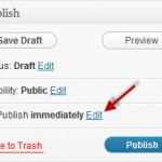
- Write the post as you’d do normally but instead of clicking the publish button when you’re done click the “Edit” link where it says “Publish immediately” text in the Publish widget.

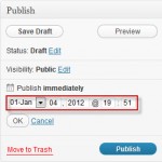
- The current date and time (in 24-hour format) is revealed.

- Enter the date and time you’d like the post to be published.

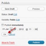
- Click the OK button.

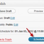
- Click the Schedule button.

- Wait.
Your post is now scheduled to be published at a time that works best for you.
Comments to this post

